
Mystic’s Premium Grading Guidelines
Collectibles like baseball cards, coins, and stamps, are graded and priced according to their condition, scarcity, and overall appeal. A group of 10 of the same stamp can have 10 different grades and values. The starting point, or base, starts with the most typical grade and is graded up or down. A graded stamp can be used or unused, have small faults or be fault-free. A grade can make a big difference in the value and price of a stamp.
Grading Mint Stamps
The following gives an idea how stamps are graded. As you will see later, there are 5 different eras, each with its own guidelines. Stamp grading is best defined as categorizing stamps according to their characteristics, such as: centering, gum, and overall condition. Sometimes a number is assigned, but more likely an abbreviation of the stamp’s grade is used.
How to Grade Stamps
Stamps are like snowflakes, no two are alike. Even today’s stamps seen side by side will have subtle differences in centering, ink color, and design.
Grading stamps requires a mix of science, history, and art. The science part requires skill and expertise, and the art is an ability to analyze the item as a whole instead of focusing on individual parts. History can fill in the missing pieces. Take a look at the stamps shown below. Printed in 1914 without perforations, sheets were cut into single strips. The strips were pasted together to form a coil roll for use in private vending machines. Vending machines were on their way out and the leftover rolls of stamps were no longer needed. Instead of being scrapped or destroyed, the stamps were perforated by hand to form a perforated coil roll. Due to the mechanics of early perforating machines, the perforations were rarely in alignment with the center of the margins.
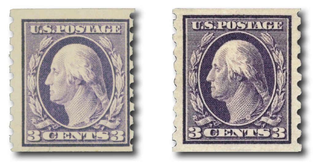
Most stamps issued from 1861-1930 are centered like the stamp on the left and will have a grade of Very Good (VG). The more evenly the design is centered or balanced between the four margins, the higher the grade and value. (Stamps with flaws can have the same grade, but the value will be lower.) A stamp with full, even margins that has never been hinged (NH), like the one shown on the right, is very scarce. Stamps with this kind of centering are extremely rare – only two examples of the stamp above are known with centering like that shown. They are known as “Gem” quality – the highest grade given. If centering is important to you, but you feel the price is more than you want to pay, you could opt for less good condition. If condition is important and cost is an issue, centering may be less important to you. In both cases the cost will be lower. It’s a matter of choice and what is important to you.
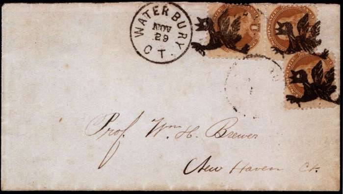
Running Chicken—Waterbury Cancelation
Grading Used (Cancelled) Stamps
Canceled stamps follow the same guidelines as mint stamps except in relation to gum. In 1847, postmasters were authorized to create their own cancels. A piece of cork was dipped in ink and applied to the stamp. It was important to obliterate or “kill” the face value to deter re-use. The whole stamp except for the denomination was to be obliterated. The more artistic postmasters would carve a design or object in to the cork. Affectionately known as “fancy cancels,” these cancellations are highly prized by collectors. The “running chicken” is the most famous fancy cancel and sold at auction for $300,000.
In many cases the stamps produced in the first two periods shown in the following information will have killer cancellations as intended by the Post Office authorities. Remember, these cancellations were produced by early postmasters and were often hand-carved.
Mystic’s Centering Guidelines
The following guidelines are detailed definitions and samples of centering and grades from four different eras of printing. These are the same guidelines our graders use. These stamps are priced according to condition and how well the stamp is centered between the 4 margins. Less than 25% of stamps issued are considered “premium” and less than 1% are perfect “Gems.”
Mystic’s Premium Grading Guidelines
1847-55 First Issues, Imperforate (Scott #1-17)

| Very Good (VG) | Design is not centered within the margins, which is typical of this issue. One or two sides cut or touch the design. Four margins may not be equal in size. |
| Fine (F) | Design is noticeably off-center. Two sides may just touch the design. Three margins may not be equal in size. |
| Very Fine (VF) | Design is slightly off center. Two sides come close but don’t touch the design. Two sides may not be equal in size. |
| Extremely Fine (XF) | Design is well centered between four margins. One side may come close to the design but will not touch it. One or two sides may not be equal in size. |
| Superb (S) | Design looks perfectly balanced and has equally balanced margins on all four sides. Under 1-X or 2-X magnification, one side may be slightly larger or smaller than the other three. |
1857-61 Issues (Scott #18-39)

1857-61 Small Margin Issues
These stamps were not designed to accommodate perforations. The stamp perforator was invented around this time period.The same plates from the first issue were used and the sheets were perforated with the newly invented Stamp Perforator. Margins were not considered and the stamps were perforated leaving extremely small margins.
| Very Good (VG) | Design is not centered within the margins, which is typical of this issue. One or two sides cut into the design. At least three margins are not equal in size. |
| Fine (F) | Design is noticeably off center, two sides touch or slightly cut into the design. Small margins may or may not be equal on two or more sides. |
| Very Fine (VF) | Design is slightly off center, two margins touch or cut the design on one or two sides. Two sides are noticeably larger or smaller than the rest. |
| Extremely Fine (XF) | Design is well centered between four margins. Two margins may touch the design or lightly cut into the design. One or two sides will be visibly larger or smaller after a closer look. |
| Superb (S) | Design is visually perfectly centered between four margins. One side can just touch the frame line. Under 1-X or 2-X magnification, one side will be just slightly larger or smaller than the other three. Extremely rare and valuable. |
1862-69 Issues (Scott #62B-101)

1869 Pictorial Issues (Scott #112-22)

1875-93 Banknote Issues (Scott #145-218)

1890-93 Small Bank Note Issues (Scott #219-29)

1893 Columbian Issues (Scott #230-45)

1894 Regular Issues (Scott #246-84)

1898 Trans-Mississippi Issues (Scott #285-92)

1861-1900 Centering Guidelines
| Very Good (VG) | Design is not centered within the margins. Two sides can touch the design or one side can cut slightly into the design. |
| Fine (F) | Design is off center, one or two sides may come close to the design but not touch or cut into the design. There will be a visible white space between the margin and the design. |
| Very Fine (VF) | Design is slightly off center, full margins clear the design on all sides. Two or three sides will be visibly larger or smaller. |
| Extremely Fine (XF) | Design is well centered between four adequate margins. One or two sides will be slightly larger or smaller. |
| Superb (S) | Visually perfect centering, design is balanced between four large margins. One side will be just slightly larger or smaller under 1-X or 2-X magnification. |
1901 Pan-American Issues (Scott #294-99)

1902-03 Issues (Scott #300-13)

1907 Jamestown Commemorative Issues (Scott #328-30)

1908-09 Issues, Perf. 12 Coil (Scott #348//389)

1908-09 Issues, Perf. 12 (Scott #331-82)

1909 Alaska Yukon Pacific Expo Issues (Scott #367-73)

1910 Washington Franklin Issues, Perf. 8.5 Coil (Scott #390-96)

1912-14 Washington Franklin Issues, Perf. 12 (Scott #405-23)

1913-15 Panama-Pacific Expo Issues (Scott #397-404)

1915 Washington Franklin Issues, Perf. 10 (Scott #424-80)

1917-19 Washington Franklin Issues, Perf. 11 (Scott #498-519)

1919 Victory Issue (Scott #537)

1919-21 Coil Waste Stamps (Scott #538-46)

1920 Pilgrim Tercentenary Issue (Scott #548-50)

1922-25 Regular Issue (Scott #551-73//631//701)

1924 Huguenot-Walloon Issues (Scott #614-16)

1926-28 Rotary Issues (Scott #632-701)

1932 Washington Bicentennial Issue (Scott #713)

1901-1940 Centering Guidelines
| Very Good (VG) | Design is not centered within the margins. Two sides can touch the design or one side can cut slightly into the design. |
| Fine (F) | Design is off center, one or two sides may come close to the design but does not touch. There will be a visible white space between the margin and the design. |
| Very Fine (VF) | Slightly off balance, full margins clear the design on all sides. Two or three sides will be visibly larger or smaller. |
| Extremely Fine (XF) | Well balanced between four adequate margins. One or two sides will be slightly larger or smaller upon closer inspection. |
| Superb (S) | Visually perfect centering, design is balanced between four large margins. One side will be just slightly larger or smaller upon close inspection. |
1940 Famous Americans Stamps (Scott #859-93)

1955 Pennsylvania Academy of Fine Arts Issue (Scott #1064)

1974 Skylab Issue (Scott #1529)

2000-11 Self-Adhesive Sheet Stamps

2000-11 Self-Adhesive Coil Stamps

Note: Stamps issued from 1940 to present are at least fine centered and generally never-hinged.
1940 – Present Centering Guidelines
| Fine (F) | Slightly off balance, full margins clear the design on all sides. One or more sides will be visibly larger or smaller than the others. |
| Very Fine (VF) | Well-balanced between four wide margins. First glance will show margins are visibly larger or smaller on one or two sides. |
| Extremely Fine (XF) | Very well-balanced between four generous margins. One or two sides will be visibly larger or smaller upon closer inspection. |
| Superb (S) | Visually perfect centering, design is balanced between four large margins. One side will be just slightly larger or smaller upon closer inspection. |