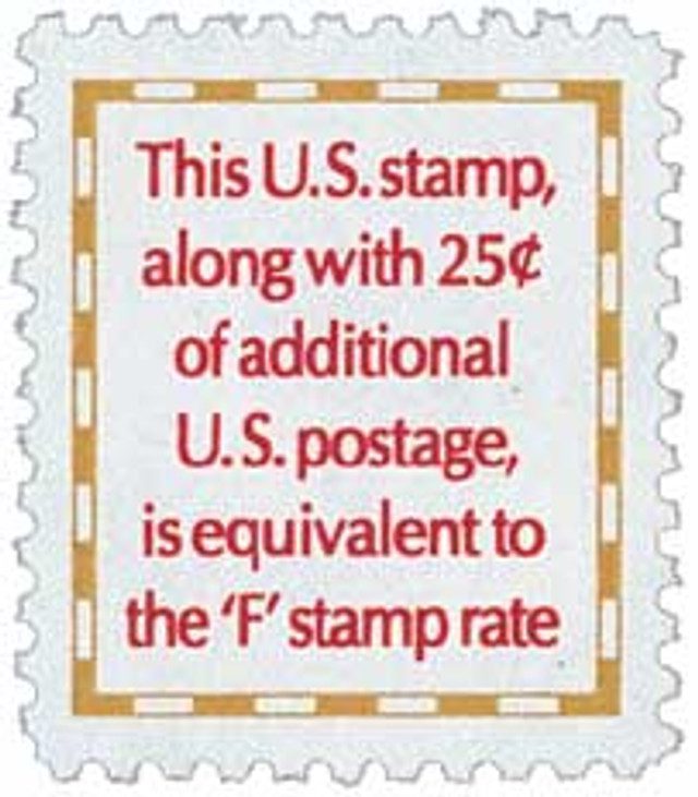
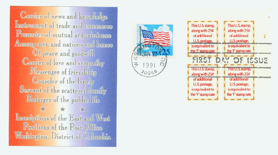
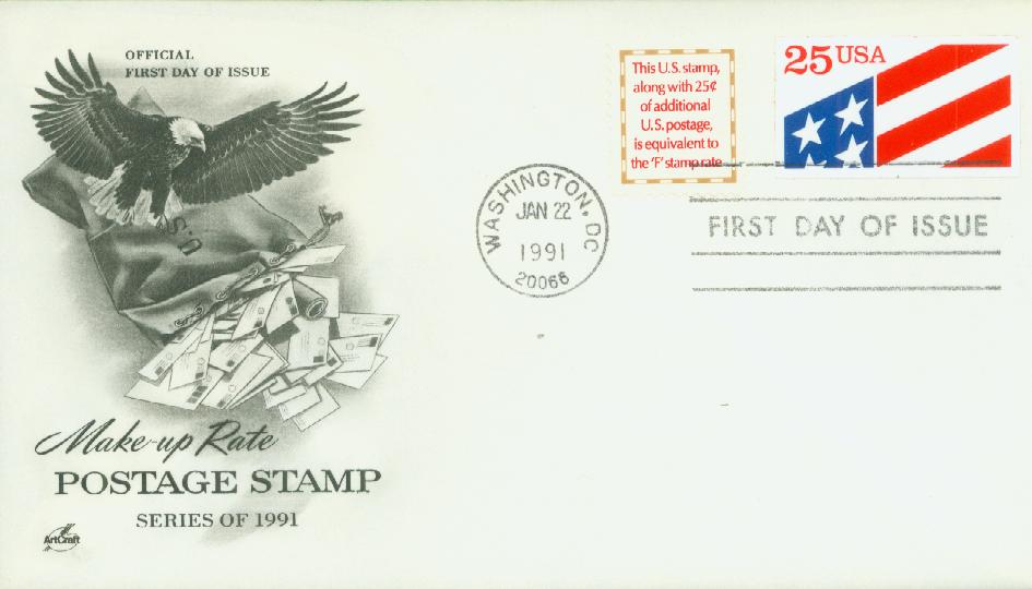
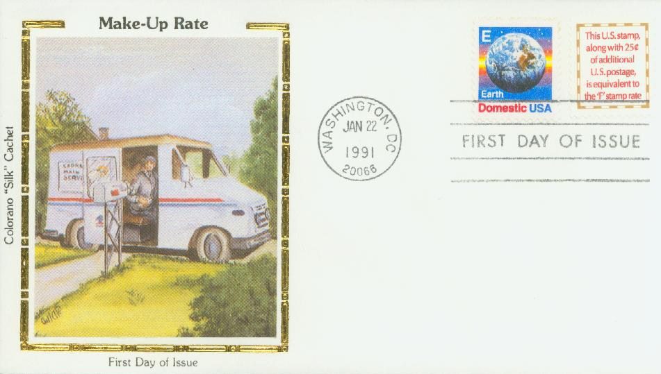
On January 22, 1991, the USPS issued a 4¢ stamp to “make-up” the difference between the old 25¢ rate and the new 29¢ rate. While it was criticized for its lack of design, it was the first non-denominated stamp of its kind.
The USPS first issued non-denominated stamps in 1975. Non-denominated stamps were created for rate changes. The rate change process was long and could take up to a year. Once it was decided, the USPS would have to rush stamps into production – a process which itself could normally take over a year. The first non-denominated stamps were a pair of Christmas stamps that simply said “US Postage” and would be valid for the postage rate at the time (10¢).
Then in 1978, the USPS began issuing its alphabet rate change stamps. The first few had the letters A through D with an eagle. And after that, rate change stamps continued to have letters, but their designs were something that started with that letter – “E” for Earth, “F” for Flower, and so on. While this solved one problem, another remained.
People who still had the previous rate change stamps needed to purchase 2¢ or 3¢ stamps to go with them. As one USPS official remarked, “Progressively, we’ve worked out the kinks of changing rates, to the point where in the 1988 rate change, we were down to just one problem. That problem involved the make-up rate.”
The USPS found out on March 22, 1988, that the first class rate would be 25¢, with a make-up rate of 3¢. The new rates would go into effect on April 3, so they couldn’t get the three million stamps needed made in that short time. And they didn’t do them earlier since the make-up rate could have been 1¢, 2¢, 3¢, or 4¢. As a result of this experience, the USPS decided when they worked on the next non-denominated alphabet stamp, they would create a non-denominated Make-up Rate stamp to ship along it in the appropriate ratios.
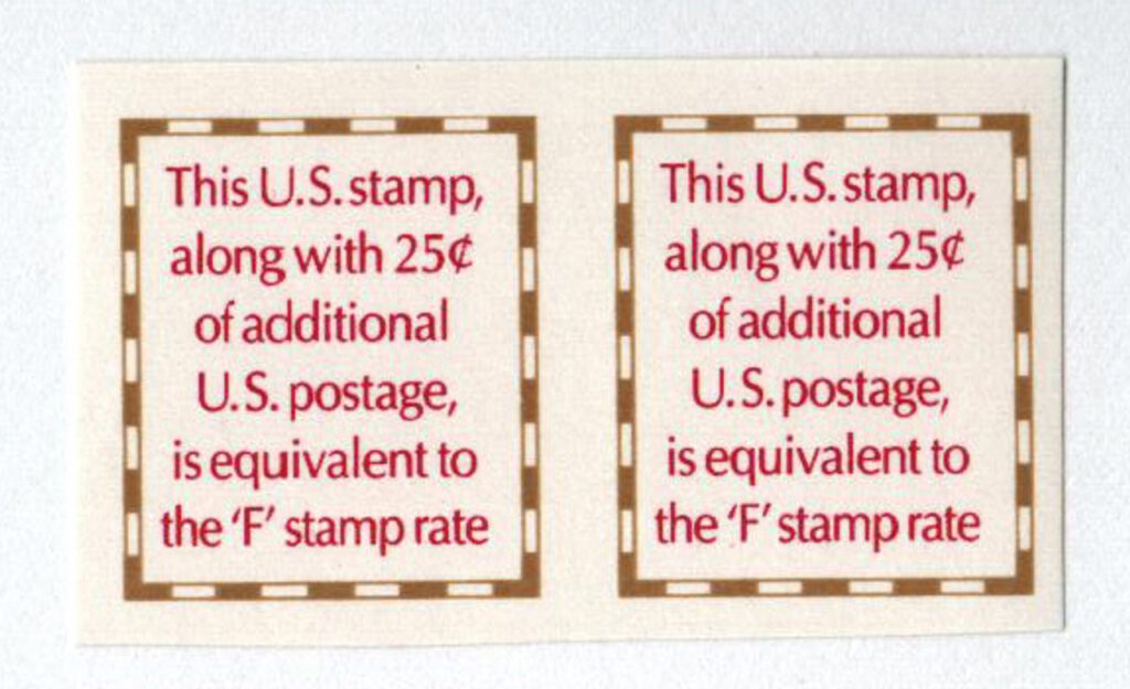
The USPS began working on this new make-up stamp in 1989. Even though the final design was quite simple, the USPS and the Citizens’ Stamp Advisory Committee spent a great deal of time going back and forth over its contents. Their major challenge was in coming up with a stamp that would make it clear to mailers what the stamp was for.
The first idea was to picture a large plus sign, so people would know that this stamp plus the old stamp, would equal the new stamp. However, they spent nearly a year working on that idea and produced about 400 different sketches of plus signs in different colors, artistic techniques, and more. When they realized that idea wouldn’t work, someone suggested they picture an ampersand – since people would use this stamp and an old stamp. A number of sketches were made for this design as well, but it was ultimately decided that people might not understand the purpose.
During the ampersand discussions, the USPS developed the wording that was needed to explain the stamp’s usage. The wording grew longer and longer and ultimately the designers explained that they couldn’t fit anything else on the stamp but those words. Once it was decided they would do just the words, a great deal of time was spent working out the exact phrasing, fonts, spacing, and more. The stamp was finally issued on January 22, 1991. It didn’t have tagging since it was intended to be used with tagged stamps. And it could be used as any other 4¢ stamp.
It was heavily criticized by the public and philatelic press for its simple design. One said it looked like the preamble to the US Constitution. Another said the next rate change stamps would be inscribed “G” for “Generic.” An English teacher also criticized the punctuation, saying “The commas separating the phrase ‘along with 25¢ of additional U.S. postage’ make it non-restrictive, thereby having no real bearing on the message in the sentence. To be correct, the stamp needs a simpler statement: “This U.S. stamp plus 25¢ additional U.S. postage is equivalent to the “F” stamp rate.’ Please note the period at the end of my sentence. The post office has evidently stopped using periods in its mad dash – no pun – to use all the commas it can!”
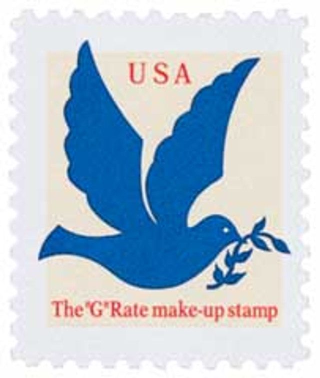
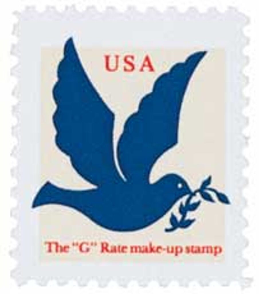
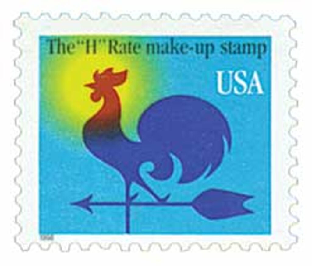
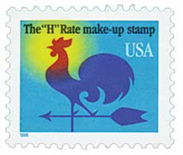
When the next rate change came in 1994, the USPS heard the complaints about the 1991 stamp and opted for a more aesthetic design. People would be more familiar with the stamp’s purpose, so fewer words were needed. In the end it pictured a dove carrying an olive branch with the words, “The ‘G’ Rate make-up stamp.” A third make-up rate design was produced in 1998 to accompany the H Rate stamp.
| FREE printable This Day in History album pages Download a PDF of today’s article. Get a binder or other supplies to create your This Day in History album. |
Discover what else happened on This Day in History.

I remember when these make-up stamps were issued. I bought a few sheets for my collection, and still have some today. Every now and then I use them with other stamps to make up the current rate. I’m sur it drives the postal people nuts.
For some reason I have always been partial to all the make-up rate stamps and I have at least one of all of them. I loved the article and it made me appreciate some of the struggles the USPS has gone through to clarify and simplify things for their customers and yet they still came under fire from the public.
I believe that The United States is the only country, if not one of the few countries in the world that is constantly raising the postage rate. I know of many other countries that rarely if ever, raise their postage rates. Some don’t even raise them at all. I wonder why this is? We live in such a wealthy and powerful country where this and other practices as I see it, should not be so.
Thank you for your website and your articles. Greatly appreciated. Had it not been for Covid, keeping me home for a year, I would not have gone back to the stamp collecting I did as a boy. It is so much fun and now I can afford mint stamps. Hooray!
Harry Kovsky